
Why Even Try, Man?
I recently came upon Brian Granger and Jake VanderPlas’s Altair, a promising young visualization library. Altair seems well-suited to addressing Python’s ggplot envy, and its tie-in with JavaScript’s Vega-Lite grammar means that as the latter develops new functionality (e.g., tooltips and zooming), Altair benefits — seemingly for free!
Indeed, I was so impressed by Altair that the original thesis of my post was going to be: “Yo, use Altair.”
But then I began ruminating on my own Pythonic visualization habits, and — in a painful moment of self-reflection — realized I’m all over the place: I use a hodgepodge of tools and disjointed techniques depending on the task at hand (usually whichever library I first used to accomplish that task1).
This is no good. As the old saying goes: “The unexamined plot is not worth exporting to a PNG.”
Thus, I’m using my discovery of Altair as an opportunity to step back — to investigate how Python’s statistical visualization options hang together. I hope this investigation proves helpful for you as well.
How’s This Gonna Go?
The conceit of this post will be: “You need to do Thing X. How would you do Thing X in matplotlib? pandas? Seaborn? ggplot? Altair?” By doing many different Thing X’s, we’ll develop a reasonable list of pros, cons, and takeaways — or at least a whole bunch of code that might be somehow useful.
(Warning: this all may happen in the form of a two-act play.)
The Options (in ~Descending Order of Subjective Complexity)
First, let’s welcome our friends2:
The 800-pound gorilla — and like most 800-pound gorillas, this one should probably be avoided unless you genuinely need its power, e.g., to make a custom plot or produce a publication-ready graphic.
(As we’ll see, when it comes to statistical visualization, the preferred tack might be: “do as much as you easily can in your convenience layer of choice [i.e., any of the next four libraries], and then use matplotlib for the rest.”)
“Come for the DataFrames; stay for the plotting convenience functions that are arguably more pleasant than the matplotlib code they supplant.” — rejected pandas taglines
(Bonus tidbit: the pandas team must include a few visualization nerds, as the library includes things like RadViz plots and Andrews Curves that I haven’t seen elsewhere.)
Seaborn has long been my go-to library for statistical visualization; it summarizes itself thusly:
“If matplotlib ‘tries to make easy things easy and hard things possible,’ seaborn tries to make a well-defined set of hard things easy too”
A Python implementation of the wonderfully declarative ggplot2. This isn’t a “feature-for-feature port of ggplot2,” but there’s strong feature overlap. (And speaking as a part-time R user, the main geoms seem to be in place.)
(Note: Since the time I wrote this post, yhat changed the name of this library from “ggplot” to “ggpy.”)
The new guy, Altair is a “declarative statistical visualization library” with an exceedingly pleasant API.
Wonderful. Now that our guests have arrived and checked their coats, let’s settle in for our very awkward dinner conversation. Our show is entitled…
Little Shop of Python Visualization Libraries (starring all libraries as themselves)
ACT I: LINES AND DOTS
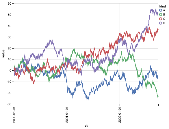
(In Scene 1, we’ll be dealing with a tidy data set named “ts.” It consists of three columns: a “dt” column (for dates); a “value” column (for values); and a “kind” column, which has four unique levels: A, B, C, and D. Here’s a preview…)
| dt | kind | value | |
|---|---|---|---|
| 0 | 2000-01-01 | A | 1.442521 |
| 1 | 2000-01-02 | A | 1.981290 |
| 2 | 2000-01-03 | A | 1.586494 |
| 3 | 2000-01-04 | A | 1.378969 |
| 4 | 2000-01-05 | A | -0.277937 |
Scene 1: How would you plot multiple time series on the same graph?
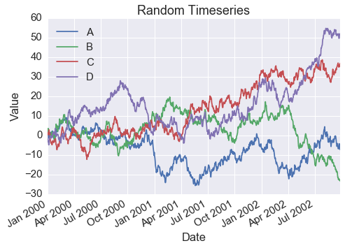
matplotlib: Ha! Haha! Beyond simple. While I could and would accomplish this task in any number of complex ways, I know your feeble brains would crumble under the weight of their ingenuity. Hence, I dumb it down, showing you two simple methods. In the first, I loop through your trumped-up matrix — I believe you peons call it a “Data” “Frame” — and subset it to the relevant time series. Next, I invoke my “plot” method and pass in the relevant columns from that subset.
# MATPLOTLIB
fig, ax = plt.subplots(1, 1,
figsize=(7.5, 5))

for k in ts.kind.unique():
tmp = ts[ts.kind == k]
ax.plot(tmp.dt, tmp.value, label=k)

ax.set(xlabel='Date',
ylabel='Value',
title='Random Timeseries')

ax.legend(loc=2)
fig.autofmt_xdate()

MPL: Next, I enlist this chump (*motions to pandas*), and have him pivot this “Data” “Frame” so that it looks like this…
# the notion of a tidy dataframe matters not here
dfp = ts.pivot(index='dt', columns='kind', values='value')
dfp.head()
| kind | A | B | C | D |
|---|---|---|---|---|
| dt | ||||
| 2000-01-01 | 1.442521 | 1.808741 | 0.437415 | 0.096980 |
| 2000-01-02 | 1.981290 | 2.277020 | 0.706127 | -1.523108 |
| 2000-01-03 | 1.586494 | 3.474392 | 1.358063 | -3.100735 |
| 2000-01-04 | 1.378969 | 2.906132 | 0.262223 | -2.660599 |
| 2000-01-05 | -0.277937 | 3.489553 | 0.796743 | -3.417402 |
MPL: By transforming the data into an index with four columns — one for each line I want to plot — I can do the whole thing in one fell swoop (i.e., a single call of my “plot” function).
# MATPLOTLIB
fig, ax = plt.subplots(1, 1,
figsize=(7.5, 5))

ax.plot(dfp)

ax.set(xlabel='Date',
ylabel='Value',
title='Random Timeseries')

ax.legend(dfp.columns, loc=2)
fig.autofmt_xdate()
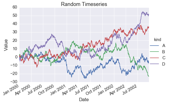
pandas (*looking timid*): That was great, Mat. Really great. Thanks for including me. I do the same thing — hopefully as good? (*smiles weakly*)
# PANDAS
fig, ax = plt.subplots(1, 1,
figsize=(7.5, 5))

dfp.plot(ax=ax)

ax.set(xlabel='Date',
ylabel='Value',
title='Random Timeseries')

ax.legend(loc=2)
fig.autofmt_xdate()
pandas: It looks exactly the same, so I just won’t show it.
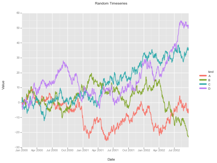
Seaborn (*smoking a cigarette and adjusting her beret*): Hmmm. Seems like an awful lot of data manipulation for a silly line graph. I mean, for loops and pivoting? This isn’t the 90’s or Microsoft Excel. I have this thing called a FacetGrid I picked up when I went abroad. You’ve probably never heard of it…
# SEABORN
g = sns.FacetGrid(ts, hue='kind', size=5, aspect=1.5)
g.map(plt.plot, 'dt', 'value').add_legend()
g.ax.set(xlabel='Date',
ylabel='Value',
title='Random Timeseries')
g.fig.autofmt_xdate()
SB: See? You hand FacetGrid your un-manipulated tidy data. At that point, passing in “kind” to the “hue” parameter means you’ll plot four different lines — one for each level in the “kind” field. The way you actually realize these four different lines is by mapping my FacetGrid to this Philistine’s (*motions to matplotlib*) plot function, and passing in “x” and “y” arguments. There are some things you need to keep in mind, obviously, like manually adding a legend, but nothing too challenging. Well, nothing too challenging for some of us…
ggplot: Wow, neat! I do something similar, but I do it like my big bro. Have you heard of him? He’s so coo–
SB: Who invited the kid?
GG: Check it out!
# GGPLOT
fig, ax = plt.subplots(1, 1, figsize=(7.5, 5))

g = ggplot(ts, aes(x='dt', y='value', color='kind')) + \
geom_line(size=2.0) + \
xlab('Date') + \
ylab('Value') + \
ggtitle('Random Timeseries')
g
GG (*picks up ggpot2 by Hadley Wickham and sounds out words*): Every plot is com — com — com-prised of data (e.g., “ts”), aesthetic mappings (e.g, “x”, “y”, “color”), and the geometric shapes that turn our data and aesthetic mappings into a real visualization (e.g., “geom_line”)!
Altair: Yup, I do that, too.
# ALTAIR
c = Chart(ts).mark_line().encode(
x='dt',
y='value',
color='kind'
)
c
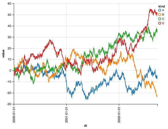
ALT: You give my Chart class some data and tell it what kind of visualization you want: in this case, it’s “mark_line”. Next, you specify your aesthetic mappings: our x-axis needs to be “date”; our y-axis needs to be “value”; and we want to split by kind, so we pass “kind” to “color.” Just like you, GG (*tousles GG’s hair*). Oh, and by the way, using the same color scheme y’all use isn’t a problem, either:
# ALTAIR

# cp corresponds to Seaborn's standard color palette
c = Chart(ts).mark_line().encode(
x='dt',
y='value',
color=Color('kind', scale=Scale(range=cp.as_hex()))
)
c
*MPL stares in terrified wonder*
Analyzing Scene 1
Aside from matplotlib being a jerk3, a few themes emerged:
- In matplotlib and pandas, you must either make multiple calls to the “plot” function (e.g., once-per-for loop), or you must manipulate your data to make it optimally fit the plot function (e.g., pivoting). (That said, there’s another technique we’ll see in Scene 2.)
- (To be frank, I never used to think this was a big deal, but then I met people who use R. They looked at me aghast.)
- Conversely, ggplot and Altair implement similar and declarative “grammar of graphics”-approved ways to handle our simple case: you give their “main” function– “ggplot” in ggplot and “Chart” in Altair” — a tidy data set. Next, you define a set of aesthetic mappings — x, y, and color — that explain how the data will map to our geoms (i.e., the visual marks that do the hard work of conveying information to the reader). Once you actually invoke said geom (“geom_line” in ggplot and “mark_line” in Altair), the data and aesthetic mappings are transformed into visual ticks that a human can understand — and thus, an angel gets its wings.
- Intellectually, you can — and probably should (?) — view Seaborn’s FacetGrid through the same lens; however, it’s not 100% identical. FacetGrid needs a hue argument upfront — alongside your data — but wants the x and y arguments later. At that point, your mapping isn’t an aesthetic one, but a functional one: for each “hue” in your data set, you’re simply calling matplotlib’s plot function using “dt” and “value” as its x and y arguments. The for loop is simply hidden from you.
- That said, even though the aesthetic maps happen in two separate steps, I prefer the aesthetic mapping mindset to the imperative mindset (at least when it comes to plotting).
Data Aside
(In Scenes 2-4, we’ll be dealing with the famous “iris” data set [though we refer to it as “df” in our code]. It consists of four numeric columns corresponding to various measurements, and a categorical column corresponding to one of three species of iris. Here’s a preview…)
| petalLength | petalWidth | sepalLength | sepalWidth | species | |
|---|---|---|---|---|---|
| 0 | 1.4 | 0.2 | 5.1 | 3.5 | setosa |
| 1 | 1.4 | 0.2 | 4.9 | 3.0 | setosa |
| 2 | 1.3 | 0.2 | 4.7 | 3.2 | setosa |
| 3 | 1.5 | 0.2 | 4.6 | 3.1 | setosa |
| 4 | 1.4 | 0.2 | 5.0 | 3.6 | setosa |
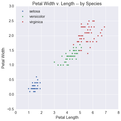
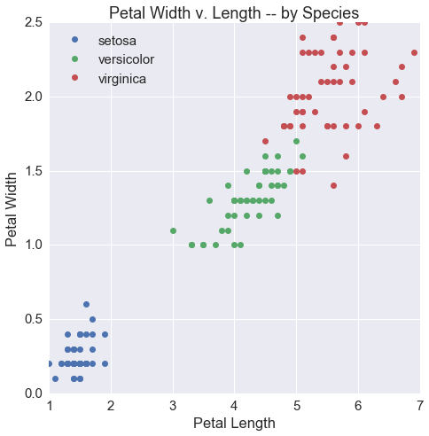
Scene 2: How would you make a scatter plot?
MPL (*looking shaken*): I mean, you could do the for loop thing again. Of course. And that would be fine. Of course. See? (*lowers voice to a whisper*) Just remember to set the color argument explicitly or else the dots will all be blue…
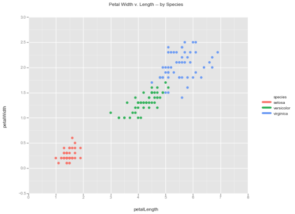
# MATPLOTLIB
fig, ax = plt.subplots(1, 1, figsize=(7.5, 7.5))

for i, s in enumerate(df.species.unique()):
tmp = df[df.species == s]
ax.scatter(tmp.petalLength, tmp.petalWidth,
label=s, color=cp[i])

ax.set(xlabel='Petal Length',
ylabel='Petal Width',
title='Petal Width v. Length -- by Species')

ax.legend(loc=2)
MPL: But, uh, (*feigning confidence*) I have a better way! Look at this:
# MATPLOTLIB
fig, ax = plt.subplots(1, 1, figsize=(7.5, 7.5))

def scatter(group):
plt.plot(group['petalLength'],
group['petalWidth'],
'o', label=group.name)

df.groupby('species').apply(scatter)

ax.set(xlabel='Petal Length',
ylabel='Petal Width',
title='Petal Width v. Length -- by Species')

ax.legend(loc=2)
MPL: Here, I define a function named “scatter.” It will take groups from a pandas groupby object and plot petal length on the x-axis and petal width on the y-axis. Once per group! Powerful!
P: Wonderful, Mat! Wonderful! Essentially what I would have done, so I will sit this one out.
SB (*grinning*): No pivoting this time?
P: Well, in this case, pivoting is complex. We can’t have a common index like we could with our time series data set, and so —
MPL: SHHHHH! WE DON’T HAVE TO EXPLAIN OURSELVES TO HER.
SB: Whatever. Anyway, in my mind, this problem is the same as the last one. Build another FacetGrid but borrow plt.scatter rather than plt.plot.
# SEABORN
g = sns.FacetGrid(df, hue='species', size=7.5)
g.map(plt.scatter, 'petalLength', 'petalWidth').add_legend()
g.ax.set_title('Petal Width v. Length -- by Species')
GG: Yes! Yes! Same! You just gotta swap out geom_line for geom_point!
# GGPLOT
g = ggplot(df, aes(x='petalLength',
y='petalWidth',
color='species')) + \
geom_point(size=40.0) + \
ggtitle('Petal Width v. Length -- by Species')
g
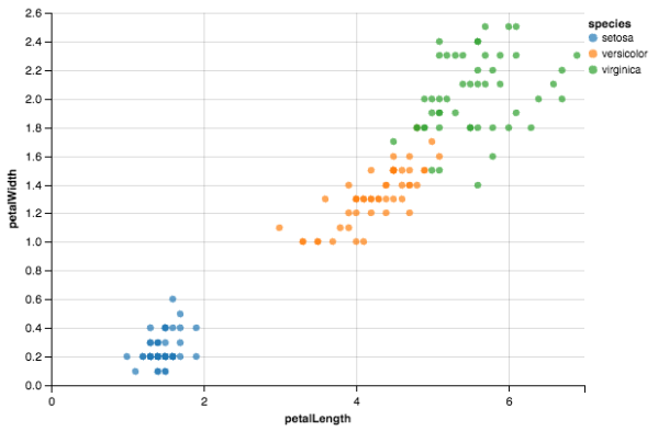
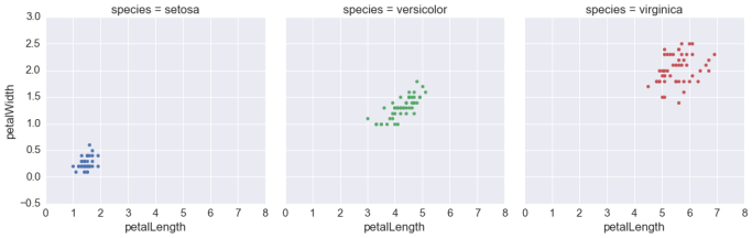
ALT (*looking bemused*): Yup — just swap our mark_line for mark_point.
# ALTAIR
c = Chart(df).mark_point(filled=True).encode(
x='petalLength',
y='petalWidth',
color='species'
)
c
Analyzing Scene 2
- Here, the potential complications that emerge from building up the API from your data become clearer. While the pandas pivoting trick was extremely convenient for time series, it doesn’t translate so well to this case.
- To be fair, the “group by” method is somewhat generalizable, and the “for loop” method is very generalizable; however, they require more custom logic, and custom logic requires custom work: you would need to reinvent a wheel that Seaborn has kindly provided for you.
- Conversely, Seaborn, ggplot, and Altair all realize that scatter plots are in many ways line plots without the assumptions (however innocuous those assumptions may be). As such, our code from Scene 1 can largely be reused, but with a new geom (geom_point/mark_point in the case of ggplot/Altair) or a new method (plt.scatter in the case of Seaborn). At this junction, none of these options seems to emerge as particularly more convenient than the other, though I love Altair’s elegant simplicity.
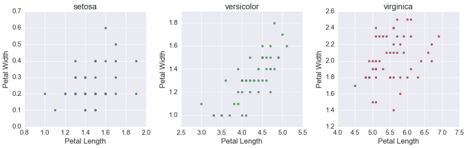
Scene 3: How would you facet your scatter plot?
MPL: Well, uh, once you’ve mastered the for loop — as I have, obviously — this is a simple adjustment to my earlier example. Rather than build a single Axes using my subplots method, I build three. Next, I loop through as before, but in the same way I subset my data, I subset to the relevant Axes object.
(*confidence returning*) AND I WOULD CHALLENGE ANY AMONG YOU TO COME UP WITH AN EASIER WAY! (*raises arms, nearly hitting pandas in the process*)
# MATPLOTLIB
fig, ax = plt.subplots(1, 3, figsize=(15, 5))

for i, s in enumerate(df.species.unique()):
tmp = df[df.species == s]

ax[i].scatter(tmp.petalLength, tmp.petalWidth, c=cp[i])

ax[i].set(xlabel='Petal Length',
ylabel='Petal Width',
title=s)

fig.tight_layout()
*SB shares a look with ALT, who starts laughing; GG starts laughing to appear in on the joke*
MPL: What is it?!
Altair: Check your x- and y-axes, man. All your plots have different limits.
MPL (*goes red*): Ah, yes, of course. A TEST TO ENSURE YOU WERE PAYING ATTENTION. You can, uh, ensure that all subplots share the same limits by specifying this in the subplots function.
# MATPLOTLIB
fig, ax = plt.subplots(1, 3, figsize=(15, 5),
sharex=True, sharey=True)

for i, s in enumerate(df.species.unique()):
tmp = df[df.species == s]

ax[i].scatter(tmp.petalLength,
tmp.petalWidth,
c=cp[i])

ax[i].set(xlabel='Petal Length',
ylabel='Petal Width',
title=s)

fig.tight_layout()
P (*sighs*): I would do the same. Pass.
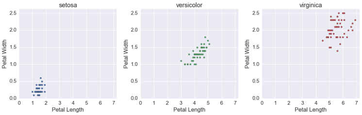
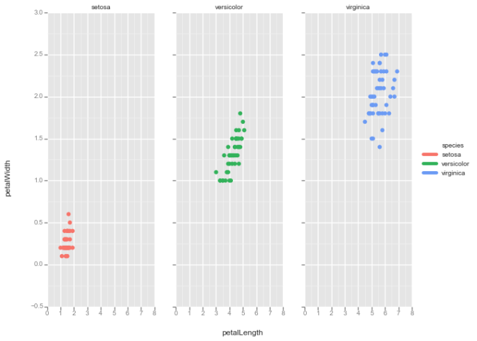
SB: Adapting FacetGrid to this case is simple. In the same way we have a “hue” argument, we can simply add a “col” (i.e., column) argument. This tells FacetGrid to not only assign each species a unique color, but also to assign each species a unique subplot, arranged column-wise. (We could have arranged them row-wise by passing in a “row” argument rather than a “col” argument.)
# SEABORN
g = sns.FacetGrid(df, col='species', hue='species', size=5)
g.map(plt.scatter, 'petalLength', 'petalWidth')
GG: Oooo — this is different from how I do it. (*again picks up ggplot2 and starts sounding out words*) See, faceting and aesthetic mapping are two fundamentally different steps, and we don’t want to in-ad-vert-ent-ly conflate the two. As such, we need to take our code from before but add a “facet_grid” layer that explicitly says to facet by species. (*shuts book happily*) At least, that’s what my big bro says! Have you heard of him, by the way? He’s so cool–4
# GGPLOT
g = ggplot(df, aes(x='petalLength',
y='petalWidth',
color='species')) + \
facet_grid(y='species') + \
geom_point(size=40.0)
g
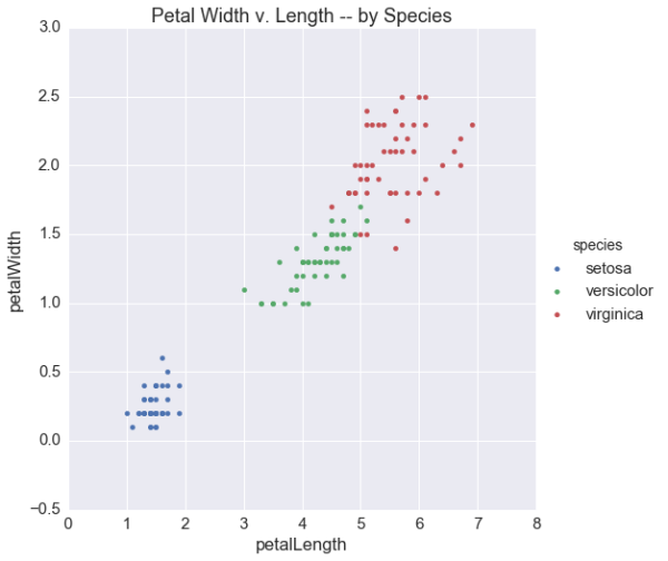
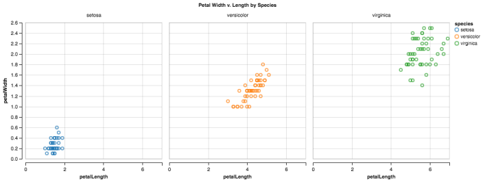
ALT: I take a more Seaborn-esque approach here. Specifically, I just add a column argument to the encode function. That said, I’m doing a couple of new things here, too: (A) While the column parameter could accept a simple string argument, I actually use a Column object instead — this lets me set a title; (B) I use my configure_cell method, since without it, the subplots would have been way too big.
# ALTAIR
c = Chart(df).mark_point().encode(
x='petalLength',
y='petalWidth',
color='species',
column=Column('species',
title='Petal Width v. Length by Species')
)
c.configure_cell(height=300, width=300)
Analyzing Scene 3
- matplotlib made a really good point: in this case, his code to facet by species is nearly identical to what we saw above; assuming you can wrap your head around the previous for loops, you can wrap your head around this one. However, I didn’t ask him to do anything more complicated — say, a 2 x 3 grid. In that case, he might have had to do something like this:
# MATPLOTLIB
fig, ax = plt.subplots(2, 3, figsize=(15, 10), sharex=True, sharey=True)

# this is preposterous -- don't do this
for i, s in enumerate(df.species.unique()):
for j, r in enumerate(df.random_factor.sort_values().unique()):
tmp = df[(df.species == s) & (df.random_factor == r)]

ax[j][i].scatter(tmp.petalLength,
tmp.petalWidth,
c=cp[i+j])

ax[j][i].set(xlabel='Petal Length',
ylabel='Petal Width',
title=s + '--' + r)

fig.tight_layout()
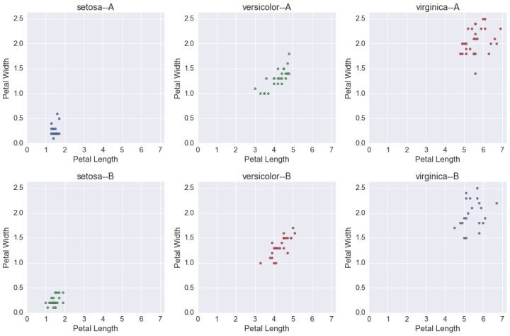
- To use the formal visualization expression: Yeesh. Meanwhile, in Altair, this would have been wonderfully simple:
# ALTAIR
c = Chart(df).mark_point().encode(
x='petalLength',
y='petalWidth',
color='species',
column=Column('species',
title='Petal Width v. Length by Species'),
row='random_factor'
)
c.configure_cell(height=200, width=200)
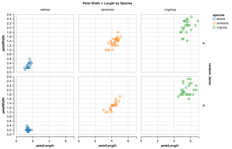
- Just one more argument to the “encode” function than we had above!
- Hopefully, the advantages of having faceting built into your visualization library’s framework are clear.
ACT 2: DISTRIBUTIONS AND BARS
Scene 4: How would you visualize distributions?
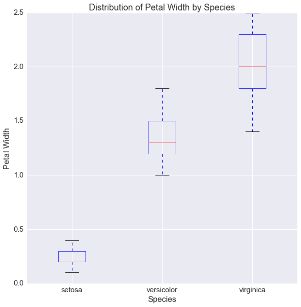
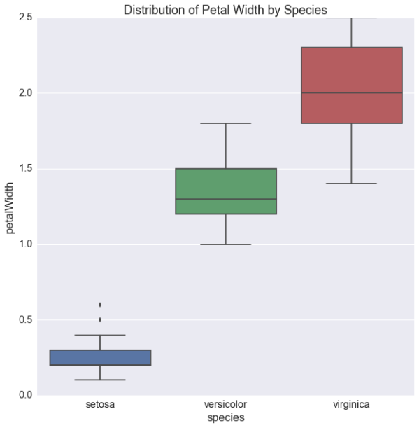
MPL (*confidence visibly shaken*): Well, if we wanted a boxplot — do we want a boxplot? — I have a way of doing it. It’s stupid; you’d hate it. But I pass an array of arrays to my boxplot method, and this produces a boxplot for each subarray. You’ll need to manually label the x-ticks yourself.
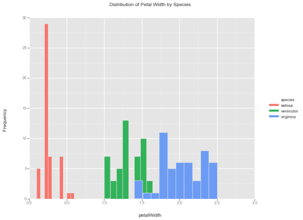
# MATPLOTLIB
fig, ax = plt.subplots(1, 1, figsize=(10, 10))

ax.boxplot([df[df.species == s]['petalWidth'].values
for s in df.species.unique()])

ax.set(xticklabels=df.species.unique(),
xlabel='Species',
ylabel='Petal Width',
title='Distribution of Petal Width by Species')
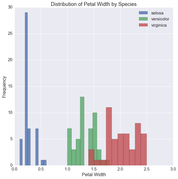
MPL: And if we wanted a histogram — do we want a histogram? — I have a method for that, too, which you can produce using either the for loop or group by methods from before.
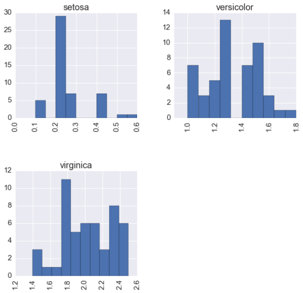
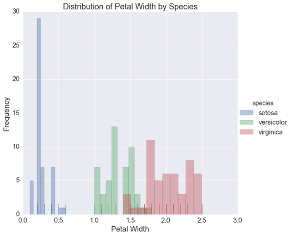
# MATPLOTLIB
fig, ax = plt.subplots(1, 1, figsize=(10, 10))

for i, s in enumerate(df.species.unique()):
tmp = df[df.species == s]
ax.hist(tmp.petalWidth, label=s, alpha=.8)

ax.set(xlabel='Petal Width',
ylabel='Frequency',
title='Distribution of Petal Width by Species')

ax.legend(loc=1)
P (*looking uncharacteristically proud*): Ha! Hahahaha! This is my moment! You all thought I was nothing but matplotlib’s patsy, and although I’ve so far been nothing but a wrapper around his plot method, I possess special functions for both boxplots and histograms — these make visualizing distributions a snap. You only need two things: (A) The column name by which you’d like to stratify; and (B) The column name for which you’d like distributions. These go to the “by” and “column” parameters, respectively, resulting in instant plots!
# PANDAS
fig, ax = plt.subplots(1, 1, figsize=(10, 10))

df.boxplot(column='petalWidth', by='species', ax=ax)
# PANDAS
fig, ax = plt.subplots(1, 1, figsize=(10, 10))

df.hist(column='petalWidth', by='species', grid=None, ax=ax)
*GG and ALT high five and congratulate P; shouts of “awesome!”, “way to be!”, “let’s go!” audible*
SB (*feigning enthusiasm*): Wooooow. Greeeeat. Meanwhile, in my world, distributions are exceedingly important, so I maintain special methods for them. For example, my boxplot method needs an x argument, a y argument, and data, resulting in this:
# SEABORN
fig, ax = plt.subplots(1, 1, figsize=(10, 10))

g = sns.boxplot('species', 'petalWidth', data=df, ax=ax)
g.set(title='Distribution of Petal Width by Species')
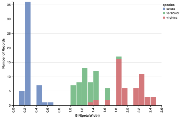
SB: Which, I mean, some people have told me is beautiful… but whatever. I also have a special distribution method named “distplot” that goes beyond histograms (*looks at pandas haughtily*). You can use it for histograms, KDEs, and rugplots — even plotting them simultaneously. For example, by combining this method with FacetGrid, I can produce a histo-rugplot for every species of iris:
# SEABORN
g = sns.FacetGrid(df, hue='species', size=7.5)

g.map(sns.distplot, 'petalWidth', bins=10,
kde=False, rug=True).add_legend()

g.set(xlabel='Petal Width',
ylabel='Frequency',
title='Distribution of Petal Width by Species')
SB: But again… whatever.
GG: THESE ARE BOTH JUST NEW GEOMS! GEOM_BOXPLOT FOR BOXPLOTS AND GEOM_HISTOGRAM FOR HISTOGRAMS! JUST SWAP THEM IN! (*starts running around the dinner table*)
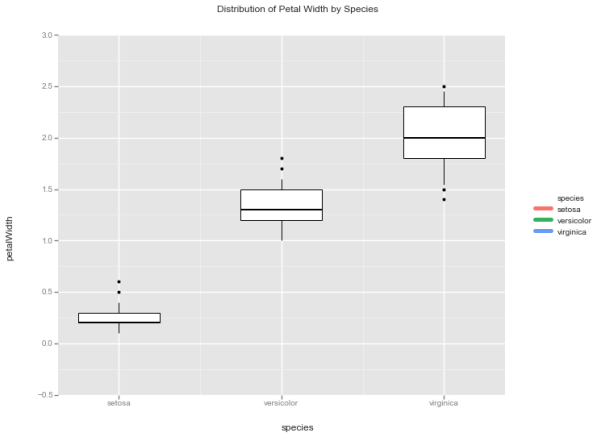
# GGPLOT
g = ggplot(df, aes(x='species',
y='petalWidth',
fill='species')) + \
geom_boxplot() + \
ggtitle('Distribution of Petal Width by Species')
g
# GGPLOT
g = ggplot(df, aes(x='petalWidth',
fill='species')) + \
geom_histogram() + \
ylab('Frequency') + \
ggtitle('Distribution of Petal Width by Species')
g
ALT (*looking steely-eyed and confident*): I… I have a confession…
*silence falls — GG stops running and lets plate fall to the floor*
ALT: (*breathing deeply*) I… I… I can’t do boxplots. Never really learned how, but I trust the JavaScript grammar out of which I grew has a good reason for this. I can make a mean histogram, though…
# ALTAIR
c = Chart(df).mark_bar(opacity=.75).encode(
x=X('petalWidth', bin=Bin(maxbins=30)),
y='count(*)',
color=Color('species', scale=Scale(range=cp.as_hex()))
)
c
ALT: The code may look weird at first glance, but don’t be alarmed. All we’re saying here is: “Hey, histograms are effectively bar charts.” Their x-axes correspond to bins, which we can define with my Bin class; meanwhile, their y-axes correspond to the number of items in the data set which fall into those bins, which we can explain using a SQL-esque “count(*)” as our argument for y.
Analyzing Scene 4
- In my work, I actually find pandas’ convenience functions very convenient; however, I’ll admit that there’s some cognitive overhead in remembering that pandas has implemented a “by” parameter for boxplots and histograms but not for lines.
- I separate Act 1 from Act 2 for a few reasons, and a big one is this: Act 2 is when using matplotlib gets particularly hairy. Remembering a totally separate interface when you want a boxplot, for example, doesn’t work for me.
- Speaking of Act 1 v. Act 2, a fun story: I actually came to Seaborn from matplotlib/pandas for its rich set of “proprietary” visualization functions (e.g., distplot, violin plots, regression plots, etc.). While I later learned to love FacetGrid, I maintain that it’s these Act 2 functions which are Seaborn’s killer app. They’ll keep me a Seaborn fan as long as I plot.
- (Moreover, I need to note: Seaborn implements a number of awesome visualizations that lesser libraries ignore; if you’re in the market for one of these, then Seaborn is your only option.)
- These examples are really when you begin to grok the power of ggplot’s geom system. Using mostly the same code (and more importantly, mostly the same thought process), we create a wildly different graph. We do this not by calling an entirely separate function, but by changing how our aesthetic mappings get presented to the viewer, i.e., by swapping out one geom for another.
- Similarly, even in the world of Act 2, Altair’s API remains remarkably consistent. Even for what feels like a different operation, Altair’s API is simple, elegant, and expressive.
Data Aside
(In the final scene, we’ll be dealing with “titanic,” another famous tidy dataset [although again, we refer to it as “df” in our code]. Here’s a preview…)
| survived | pclass | sex | age | fare | class | |
|---|---|---|---|---|---|---|
| 0 | 0 | 3 | male | 22.0 | 7.2500 | Third |
| 1 | 1 | 1 | female | 38.0 | 71.2833 | First |
| 2 | 1 | 3 | female | 26.0 | 7.9250 | Third |
| 3 | 1 | 1 | female | 35.0 | 53.1000 | First |
| 4 | 0 | 3 | male | 35.0 | 8.0500 | Third |
In this example, we’ll be interested in looking at the average fare paid by class and by whether or not somebody survived. Obviously, you could do this in pandas…
dfg = df.groupby(['survived', 'pclass']).agg({'fare': 'mean'})
dfg
| fare | ||
|---|---|---|
| survived | pclass | |
| 0 | 1 | 64.684008 |
| 2 | 19.412328 | |
| 3 | 13.669364 | |
| 1 | 1 | 95.608029 |
| 2 | 22.055700 | |
| 3 | 13.694887 |
…but what fun is that? This is a post on visualization, so let’s do it in the form of a bar chart!)
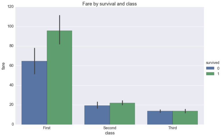
Scene 5: How would you create a bar chart?
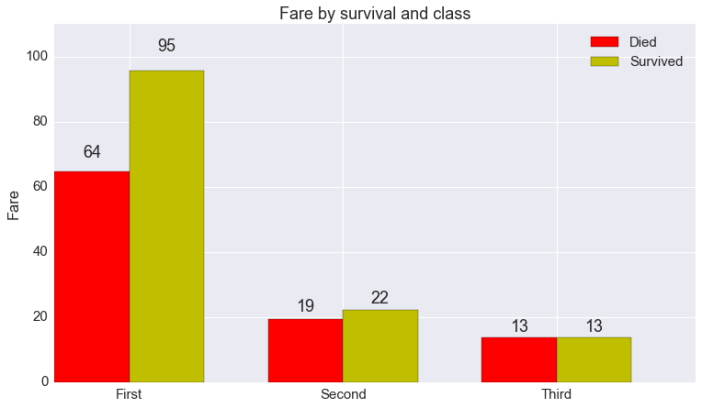
MPL (*looking grim*): No comment.
# MATPLOTLIB

died = dfg.loc[0, :]
survived = dfg.loc[1, :]

# more or less copied from matplotlib's own
# api example
fig, ax = plt.subplots(1, 1, figsize=(12.5, 7))

N = 3

ind = np.arange(N)  # the x locations for the groups
width = 0.35        # the width of the bars

rects1 = ax.bar(ind, died.fare, width, color='r')
rects2 = ax.bar(ind + width, survived.fare, width, color='y')

# add some text for labels, title and axes ticks
ax.set_ylabel('Fare')
ax.set_title('Fare by survival and class')
ax.set_xticks(ind + width)
ax.set_xticklabels(('First', 'Second', 'Third'))

ax.legend((rects1[0], rects2[0]), ('Died', 'Survived'))

def autolabel(rects):
# attach some text labels
for rect in rects:
height = rect.get_height()
ax.text(rect.get_x() + rect.get_width()/2., 1.05*height,
'%d' % int(height),
ha='center', va='bottom')

ax.set_ylim(0, 110)

autolabel(rects1)
autolabel(rects2)

plt.show()
*everyone else shakes their head*
P: I need to do some data manipulation first — namely, a group by and a pivot — but once I do, I have a really cool bar chart method — much simpler than that mess above! Wow, I’m feeling so much more confident — who knew all I had to was put someone else down!?5
# PANDAS
fig, ax = plt.subplots(1, 1, figsize=(12.5, 7))
# note: dfg refers to grouped by
# version of df, presented above
dfg.reset_index().\
pivot(index='pclass',
columns='survived',
values='fare').plot.bar(ax=ax)

ax.set(xlabel='Class',
ylabel='Fare',
title='Fare by survival and class')
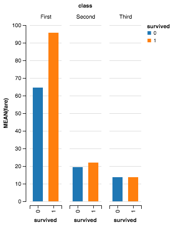
SB: Again, I happen to think tasks such as this are extremely important. As such, I implement a special function named “factorplot” to help out:
# SEABORN
g = sns.factorplot(x='class', y='fare', hue='survived',
data=df, kind='bar',
order=['First', 'Second', 'Third'],
size=7.5, aspect=1.5)
g.ax.set_title('Fare by survival and class')
SB: As ever, you pass in your un-manipulated data frame. Next, you explain what you would like to group by — in this case, it’s “class” and “survived,” so these become our “x” and “hue” arguments. Next, you explain what numeric field you would like summaries for — in this case, it’s “fare,” so this becomes our “y” argument. The default summary statistic is mean, but factorplot possesses a parameter named “estimator,” where you can specify any function you want, e.g., sum, standard deviation, median, etc. The function you choose will determine the height of each bar.
Of course, there are many ways to visualize this information, only one of which is a bar. As such, I also have a “kind” parameter where you can specify different visualizations.
Finally, some of us still care about statistical certainty, so by default, I bootstrap you some error bars so you can see if the differences in average fair between classes and survivorship are meaningful.
(*under her breath*) Would like to see any of you top that…
*ggplot2 pulls up in his Lamborghini and walks through the door*
ggplo2: Hey, have y’all see–
GG: HEY BRO.
GG2: Hey, little man. We gotta go.
GG: Wait, one sec — I gotta make this bar plot real quick, but I’m having a hard time. How would you do it?
GG2 (*reading instructions*): Ah, like this:
# GGPLOT2

# in R, I believe you'd do something like this:

ggplot(df, aes(x=factor(survived), y=fare)) +
stat_summary_bin(aes(fill=factor(survived)),
fun.y=mean) +
facet_wrap(~class)

# damn ggplot2 is awesome...
GG2: See? You define your aesthetic mappings like we always talk about, but you need to turn your “y” mapping into average fare. To do so, I get my pal “stat_summary_bin” to do that for me by passing in “mean” to his “fun.y” parameter.
GG (*eyes wide in amazement*): Oh, whoa… I don’t think I have stat_summary yet. I guess — pandas, could you help me out?
P: Uh, sure.
GG: Weeeee!
# GGPLOT
g = ggplot(df.groupby(['class', 'survived']).\
agg({'fare': 'mean'}).\
reset_index(), aes(x='class',
fill='factor(survived)',
weight='fare',
y='fare')) + \
geom_bar() + \
ylab('Avg. Fare') + \
xlab('Class') + \
ggtitle('Fare by survival and class')
g
GG2: Huh, not exactly grammar of graphics-approved, but I guess so long as Hadley doesn’t find out it seems to work fine… In particular, you shouldn’t have to summarize your data in advance of your visualization. I’m also confused by what “weight” means in this context…
GG: Well, by default, my bar geom seems to default to simple counts, so without a “weight,” all the bars would have had a height of one.
GG2: Ah, I see… Let’s talk about that later later.
*GG and GG2 say their goodbyes and leave the dinner party*
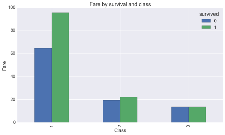
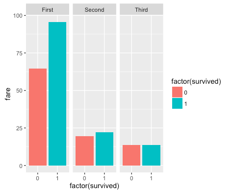
ALT: Ah, now this is my bread-and-butter. It’s really simple.
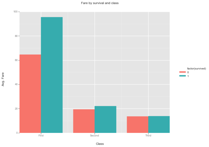
# ALTAIR
c = Chart(df).mark_bar().encode(
x='survived:N',
y='mean(fare)',
color='survived:N',
column='class')
c.configure_facet_cell(strokeWidth=0, height=250)
ALT: I’m hoping all the arguments are intuitive by this point: I want to plot mean fare by survivorship — faceted by class. This directly translates into “survived” as the x argument; “mean(fare)” as the y argument; and “class” as the column argument. (I specify the color argument for some pizazz.)
That said, a couple of new things are happening here. Notice how I append “:N” to the “survived” string in the x and color arguments. This is a note to myself which says, “This is a nominal variable.” I need to put this here because survived looks like a quantitative variable, and a quantitative variable would lead to a slightly uglier visualization of this plot. Don’t be alarmed: this has been happening the whole time — just implicitly. For example, in the time series plots above, if I hadn’t known “dt” was a temporal variable I would have assumed they were nominal variables, which… would have been awkward (at least until I appended “:T” to clear things up.
Separately, I invoke my configure_facet_cell protocol to make my three subplots look more unified.
Analyzing Scene 5
- Don’t overthink this one: I’m never making a bar chart in matplotlib again, and to be clear, it’s nothing personal! The fact is: unlike the other libraries, matplotlib doesn’t have the luxury of making any assumptions about the data it receives. Occasionally, this means you’ll have pedantically imperative code.
- (Of course, it’s this same data agnosticism that allows matplotlib to be the foundation upon which Python visualization is built.)
- Conversely, whenever I need summary statistics and error bars, I will always and forever turn to Seaborn.
- (It’s potentially unfair I chose an example that seems tailor-made to one of Seaborn’s functions, but it comes up a lot in my work, and hey, I’m writing the blog post here.)
- I don’t find either the pandas approach or the ggplot approach particularly offensive.
- However, in the pandas case, knowing you must group by and pivot — all in service of a simple bar chart — seems a bit silly.
- Similarly, I do think this is the main hole I’ve found in yhat’s ggplot — having a “stat_summary” equivalent would go a long way toward making this thing wonderfully full-featured.
- Meanwhile, Altair continues to impress! I was struck by how intuitive the code was for this example. Even if you’d never seen Altair before, I imagine someone could intuit what was happening. It’s this type of 1:1:1 mapping between thinking, code, and visualization that is my favorite thing about the library.
Final Thoughts
You know, sometimes I think it’s important to just be grateful: we have a ton of great visualization options, and I enjoyed digging into all of them!
(Yes, this is a cop-out.)
Although I was a bit hard on matplotlib, it was all in good fun (every play needs comedic relief). Not only is matplotlib the foundation upon which pandas plotting, Seaborn, and ggplot are built, but the fine-grained control he gives you is essential. I didn’t touch on this, but in almost every non-Altair example, I used matplotlib to customize our final graph. But — and this is a big “but” — matplotlib is purely imperative, and specifying your visualization in exacting detail can get tedious (see: bar chart).
Indeed, the upshot here is probably: “Judging matplotlib on the basis of its statistical visualization capabilities is kind of unfair, you big meanie. You’re comparing one of its use cases to the other libraries’ primary use case. These approaches obviously need to work together. You can use your preferred convenience/declarative layer — pandas, Seaborn, ggplot, or one day Altair (see below) — for the basics. Then you can use matplotlib for the non-basics. When you run up against the limitations of what these other libraries can do, you’ll be happy to have the limitless power of matplotlib at your side, you ungrateful aesthetic amateur.”
To which I’d say: yes! That seems quite sensible, Disembodied Voice… although just saying that wouldn’t make for much of a blog post.
Plus… I could do without the name-calling 😦
Meanwhile, pivoting plus pandas works wonders for time series plots. Given how good pandas’ time series support is more broadly, this is something I’ll continue to leverage. Moreover, the next time I need a RadViz plot, I’ll know where to go. That said, while pandas does improve upon matplotlib’s imperative paradigm by giving you basic declarative syntax (see: bar chart), it’s still fundamentally matplotlib-ish.
Moving on: if you want to do anything more stats-y, use Seaborn (she really did pick up a ton of cool things when she went abroad). Learn her API — factorplot, regplot, displot, et al — and love it. It will be worth the time. As for faceting, I find FacetGrid to be a very useful partner in crime; however, if I hadn’t worked with Seaborn for so long, it’s possible I would prefer the ggplot or Altair versions.
Speaking of declarative elegance, I’ve long loved ggplot2, and for the most part came away impressed by how well Python’s ggplot managed to hang in example-for-example. This is a project I will definitely continue to monitor. (More selfishly, I hope it prevents my R-centric coworkers from making fun of me.)
Finally, if the thing you want to do is implemented in Altair (sorry, boxplot jockeys), it boasts an amazingly simple and pleasant API. Use it! If you need additional motivation, consider the following: one exciting thing about Altair — other than forthcoming improvements to its underlying Vega-Lite grammar — is that it technically isn’t a visualization library. It emits Vega-Lite approved JSON blobs, which — in notebooks — get lovingly rendered by IPython Vega.
Why is this exciting? Well, under the hood, all of our visualizations looked like this:
Granted, that doesn’t look exciting, but think about the implication: if other libraries were interested, they could also develop ways to turn these Vega-Lite JSON blobs into visualizations. That would mean you could do the basics in Altair and then drop down to matplotlib for more control.
I am already salivating about the possibilities.
All of that said, some parting words: visualization in Python is larger than any single man, woman, or Loch Ness Monster. Thus, you should take everything I said above — code and opinions alike — with a grain of salt. Remember: everything on the internet amounts to lies, damned lies, and statistics.
I hope you enjoyed this far nerdier version of Mad Hatter’s Tea Party, and that you learned some things you can take to your own work.
As always, code is available.
Notes
First, a huge thank you to redditor /u/counters, who provided extremely valuable feedback/perspective in the form of this comment. I incorporated some of it into the “Final Thoughts” section; however, my rambling is far less articulate. Which is to say: read the comment; it’s good.
Second, a huge thank you to Thomas Caswell, who left a phenomenal comment below about matplotlib’s features that you should absolutely read. Doing so will lead to matplotlib code that is far more elegant than my meager offering above.
1Strictly speaking, this story isn’t true. I’ve almost always used Seaborn if I could, dropping down to matplotlib when I needed the customizability. That said, I find this premise to be a more compelling set-up, plus we’re living in a post-truth society anyway.
2Right off the bat, you’re mad at me, so allow me to explain: I love bokeh and plotly. Indeed, one of my favorite things to do before sending out an analysis is getting “free interactivity” by passing my figures to the relevant bokeh/plotly functions; however, I’m not familiar enough with either to do anything more sophisticated. (And let’s be honest — this post is long enough.)
Obviously, if you’re in the market for interactive visualizations (versus statistical visualizations), then you should probably look to them.
3Please note: this is all in good fun. I am rendering no judgments on any library with my amateur anthropomorphism. I’m sure matplotlib is very charming in real life.
4To be frank, I’m not totally sure if faceting is handled separately for ideological purity or if it’s simply a practical concern. While my ggplot character claims it’s the former (his understanding is based on a hasty reading of this paper), it may be that ggplot2 has such rich faceting support that — practically speaking — it needs to happen as a separate step. If my characterization offends any grammar of graphics disciples, please let me know and I’ll find a new bit.
5Absolutely not the moral of this story

October 3, 2016 at 4:42 am
Great post, I was wondering whether you left Bokeh out for a reason?
LikeLike
October 3, 2016 at 2:07 pm
No particular reason — I’m actually just less familiar with it (and to a lesser extent, it’s because this post focuses on statistical visualization and I actually hadn’t realized bokeh implemented a higher-level Charts API that might be good for that use case).
To be frank, I think I need to do another pass and add it in, since a lot of folks seem to be asking for it 😉
Thanks a ton for reading/commenting!
LikeLiked by 1 person
October 4, 2016 at 3:30 pm
Yes, please: I would LOVE to read your story about bokeh and plot.ly. Looking forward!
LikeLike
October 3, 2016 at 10:27 am
Just fell in love with you blog. Thanks for that!
LikeLike
October 3, 2016 at 2:08 pm
Glad you enjoyed it — thanks a ton for reading/commenting!
LikeLiked by 1 person
October 3, 2016 at 1:50 pm
Great job!, Would love to see BQ plot and Bokeh added! I know just too many..
LikeLike
October 3, 2016 at 2:09 pm
Thank you for reading! One nice thing about this post is that I’ve learned about a lot of new visualization libraries, so I think I’ll need to do a Part 2 at some point 😉
BQ plot looks very interesting — thanks for introducing me!
LikeLiked by 1 person
October 4, 2016 at 2:08 am
Some of the specific (slightly defensive) feedback about mpl’s features.
– in mpl v2.0.0b4 (available now on conda-forge/pypi) and above color cycle on `scatter` cycles automatically (draft of 2.0 style changes http://matplotlib.org/devdocs/users/dflt_style_changes.html )
– as of mpl v1.5.0 and above all of the plotting functions take a `data` kwarg which just needs to be anything that supports `__getitem__` with strings (ex DataFrame, dict, h5py object) and you can write things like `ax.plot(‘th’, ‘sin’, data=df)` and it will do the right thing (http://matplotlib.org/users/whats_new.html#working-with-labeled-data-like-pandas-dataframes)
– as of mpl v1.5.0 the index on a pd.Series will be automatically detected as will it’s name.
– on the master brach (so targeting v2.1) there is support for categorical values (denoted by string names) so `ax.plot([‘a’, ‘b’, ‘c’], [1, 2, 3])` will do what you expect.
– I do not think that cycler objects (http://matplotlib.org/cycler/) have been exploited as much as they could be for example
“`python
fig, ax_array = plt.subplots(3, 3)
cy = cycler(‘c’, ‘rgb’) * (cycler(‘marker’, [‘x’, ‘o’, ‘*’]) + cycler(‘linestyle’, [‘-‘, ‘–‘, ‘:’]))
for ax, g, sty in zip(ax_array.ravel(), df.groupby(..), cy):
some_plotting_function(ax, g, **sty)
“`
The distinction between ‘fit your data to the API’ or ‘build the API to your data’ is an important point. mpl is the underlying strata of this operation and hence must be very agnostic to _what_ the data means. User can (and should http://matplotlib.org/faq/usage_faq.html#coding-styles !) write helper functions that encode any extra assumptions that they can make about your data to make meaningful plots easily.
Everyone agrees that altair needs to talk to mpl / bokeh / holoviews / bqplot, the limiting factor is resources to make it happen. The quickest path to that is an implementation is a) an implementation of all of the aggregation that is being done under the hood by vega in python in altair (so that each of the above does not have to re-implement said aggregation) and b) a stand-alone ‘scales’ project for mapping between data space and to any of the aesthetic ranges.
If anyone is interested in helping with this, please contact me or Brian Granger.
LikeLiked by 2 people
October 4, 2016 at 2:33 am
Thank you for the very detailed comment — this is all phenomenal feedback!
My sincerest apologies if it seemed like I was picking on matplotlib; I absolutely didn’t intend it that way. (Indeed, I was mostly trying to be funny.)
I tried to emphasize that I was approaching this problem from my very narrow “statistical visualization” POV, and that matplotlib handles situations that would cause other libraries to break down and cry.
(Also, I figure everyone uses matplotlib anyway 😉 ).
Again, appreciate all of your time. Thank you for reading! I will change the API-related commentary to be more precise, and also be sure to direct readers to your comment so they can better utilize matplotlib’s newer features!
LikeLike
October 4, 2016 at 2:49 am
Don’t worry, It did read as funny 🙂
We are trying upstream to make these higher-level plotting things easier (or at least to make building the things that make these things easier easier), we just move _slow_.
LikeLike
October 4, 2016 at 3:25 am
Whew — thanks — that makes me feel a lot better. I spent my formative plotting years in matplotlib, so I would never want to show it anything but love.
And I should note: thank you for all the work you do to keep matplotlib awesome!
LikeLike
October 4, 2016 at 6:34 am
In R I would use:
ggplot(
data = titanic,
aes(x = pclass, y = fare, group = survived, fill=factor(survived))
) + geom_bar(
position=”dodge”,
stat = “identity”
)
LikeLike
October 10, 2018 at 3:06 pm
Not correct as the stat=”identity” will give you a sum of fares and not the average.
But quite close…
library(titanic)
library(ggplot2)
ggplot(data = titanic_train, aes(x = Pclass, y = Fare, group = Survived, fill=factor(Survived))) +
stat_summary(fun.y=”mean”, geom=”bar”, position = “dodge”)
LikeLike
October 4, 2016 at 7:45 am
This article is GREAT. Personally I have been working with matplotlib for so long, and I have so little time, I can’t justify doing this kind of landscape survey. So thanks a bunch!
The love/hate relationship with matplotlib is showing. I can relate — it takes a while to explain matplotlib what you want, but you’ll always succeed in the end.
LikeLike
October 17, 2016 at 3:27 pm
Absolutely: I do hope I managed to show matplotlib the adequate amount of love. I really do think it’s fantastic for so many things, but for folks who need a new partner in statistical visualization crime, I’m also hoping this post gives you some intriguing things to look into.
LikeLike
October 4, 2016 at 1:53 pm
I also very much like ggplot2. This library provides ggplot2 syntax in Python using a very thin wrapper around R’s ggplot2 library.
https://github.com/sirrice/pygg
LikeLike
October 17, 2016 at 3:23 pm
This looks very cool — thank you for reading/sharing!
LikeLike
October 4, 2016 at 3:50 pm
Wow. This post is written so well. Thank you!
LikeLike
October 17, 2016 at 3:23 pm
Thank you — very glad you enjoyed it!
LikeLike
October 4, 2016 at 10:13 pm
This is so fantastic, we honestly should think of “producing” this play at the next PyCon or SciPy? I even don’t care what role I’d play, it’s just so much fun! 😉
LikeLike
October 6, 2016 at 11:31 pm
Great post! Thanks.
LikeLike
October 7, 2016 at 5:33 pm
Very interesting. One thing you left out about the grammar of graphics are stats and scales. I think one may ignore scales on a first pass, but stats are commingled with geoms as default stats in ggplot for R. That is, when you do a scatter you are not summarizing the data, but when you do a boxplot you are. Geom should refer more strictly to graphical elements, not statistical concepts. From the ggvis docs: “In ggplot2, the definition of a geom was somewhat blurred, because of things like geom_histogram() which combined geom_bar() with stat_bin(). The distinction is more clear in ggvis: pure geoms correspond to marks, and combined geoms and stats correspond to layers.” I am not an expert in ggvis, and the extensive renaming of familiar concepts is a turnoff for me, but in theory this distinction is there. In any event, I think a python library would benefit from keeping stats and geoms as separate concepts.
LikeLike
October 7, 2016 at 5:41 pm
Well, on a second read I noticed the use of stat_bin. So the “left out” above is not completely accurate.
LikeLike
October 9, 2016 at 4:43 am
Reblogged this on Importantish.
LikeLike
October 16, 2016 at 2:29 pm
Thanks a lot for the amazing survey. I would suggest you to look into python PyX http://pyx.sourceforge.net/gallery/graphs/index.html
It’s really great, sometimes a bit technical but creates beautiful graphs and includes LateX support ❤
LikeLike
October 17, 2016 at 3:21 pm
Will do — thanks for sharing!
LikeLike
October 17, 2016 at 7:40 am
Like this post. Thank you.
LikeLike
October 17, 2016 at 7:44 am
Great article. Just a small point, but in Python you don’t need to escape line breaks inside brackets. (If you aren’t inside brackets, you should put the brackets in and not escape the line break).
LikeLike
October 17, 2016 at 4:10 pm
Reblogged this on Python for the everything lazy..
LikeLike
October 17, 2016 at 4:47 pm
Your link to seaborn website is incorrect.
LikeLike
October 22, 2016 at 7:30 pm
Thanks for flagging — will make the change to the new documentation
LikeLike
October 18, 2016 at 6:19 am
I’d suggest using zip instead of enumerate. There’s no need to index into an interable as if this was Matlab or something! 😉
LikeLike
October 22, 2016 at 5:20 pm
Haha — very fair point — good suggestion! Thanks for reading/commenting!
LikeLike
October 19, 2016 at 7:25 am
Reblogged this on josephdung.
LikeLike
December 1, 2016 at 3:28 am
Well written, Thanks.
LikeLike
December 28, 2016 at 9:50 pm
Great post! I’ve been using a similar conglomeration of solutions and completely agree, especially re: never use mpl for barplots because it’s just so much harder than it needs to be, although I’m almost always working directly out of pandas anyway so it’s kind of a moot point…
One thing I’m wondering about is how well these libraries all handle datetime formatting. I can usually figure out what I’m looking for, but it’s always laborious and time-consuming, and even more so now with the overly clever features in Jupyter notebook (which often truncate the actual timestamps for pretty printing output) and matplotlib (with autoformatting that is not always defaulting to the format I want).
Would love to see a followup post with your favorite solutions for those kinds of situations – particularly data sets with non-monotonic timeseries.
LikeLike
January 5, 2017 at 7:54 am
This was great! I have been doing barplotting in matplotlib until now. It seems to be the right time to start exploring pandas and SeaBorn…
LikeLike
January 5, 2017 at 4:44 pm
Thanks — glad you enjoyed it/found it helpful!
LikeLike
January 20, 2017 at 5:48 pm
This is brilliant. The content is awesome and the writing is amazing!
LikeLike
January 20, 2017 at 8:37 pm
Thanks a ton for reading/commenting! Glad you enjoyed it 🙂
LikeLike
March 18, 2017 at 1:21 pm
Really awesome post men, just what i need for my thesis work! 😀
thanks a lot!
LikeLike
April 20, 2017 at 4:48 pm
Just came over after reading this reposted to Yhat’s blog. Wonderfully useful and personable. Thanks for sharing your work.
LikeLike
April 20, 2017 at 5:30 pm
Thank you so much for the kind words — happy you found this helpful!
LikeLike
May 1, 2017 at 10:54 pm
Could I get this “ts” dataset and try the code?
LikeLike
May 2, 2017 at 2:17 am
Hi Severin — all the code (and data) is available here: https://github.com/dsaber/py-viz-blog
LikeLike
May 26, 2017 at 12:50 pm
Another visit from the Yhat blog. Brilliant post, very funny and informative, and the final comments are interesting too. I am also a big Seaborn fan (even if I’m far less fluent with it), and while I agree that its wide array of builtin visualizations is probably its best feature, I personally loved the idea of “context” to set sensible defaults for papers, talks or posters (which span all matplotlib’s plots, not just Seaborn’s). I don’t know what would Altair/Vega(-lite) and ggpy/ggplot(2) have to say about that, although I guess they have some aces up their sleeves to do something similar.
LikeLike
October 17, 2017 at 12:52 pm
Great job! Thanks a lot for this 🙂
LikeLike
November 13, 2017 at 1:50 am
You can avoid those nested loops in your 2×3 grid for matplotlib by iterating directly over the axes array: for sub_ax in ax.flat
LikeLike
November 13, 2017 at 1:52 am
Or, as I read again and realise that you want rows to represent a separate facet, perhaps not!
LikeLike
June 1, 2018 at 1:41 pm
wow…
excelllent. i used some parts in my code. my thesis is about fraud detection in banking.
LikeLike
June 21, 2019 at 2:38 pm
Wow, years later this is still a great reference. I started with R and ggplot and didn’t realize how spoiled I was until I started trying to make quality visualizations in python. I wouldn’t have known about Altair, which seems like the clear way to go, without this post. Thanks!
LikeLike